
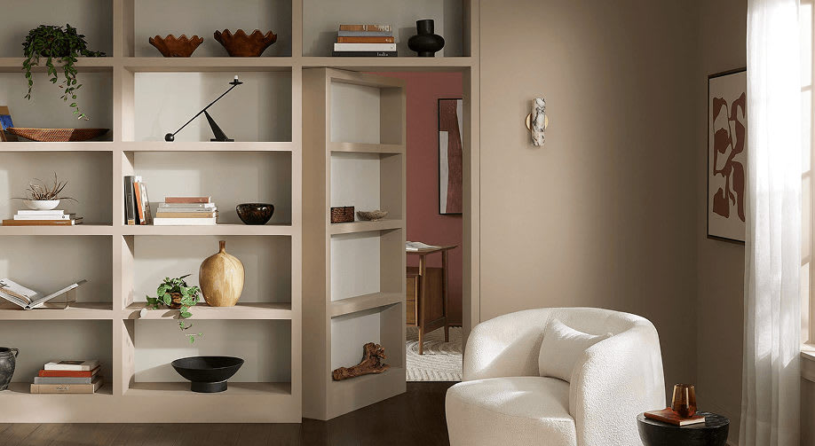

A fresh take on neutral paint colors, and why this warm taupe-beige deserves a closer look.
There is something special about finding a paint color that makes a room feel instantly more inviting. Not too gray, not too beige, and certainly not boring. The right neutral creates a beautiful backdrop for a home, allowing furniture, textures, artwork, and architectural details to shine.
That's why Sherwin-Williams' November 2026 Color of the Month caught my attention: Sanderling SW 7513.
It's a soft taupe-beige with a creamy warmth that feels relaxed, sophisticated, and wonderfully versatile. I especially love that it offers a little more depth and character than a traditional off-white or builder-grade beige without making a room feel dark or heavy.
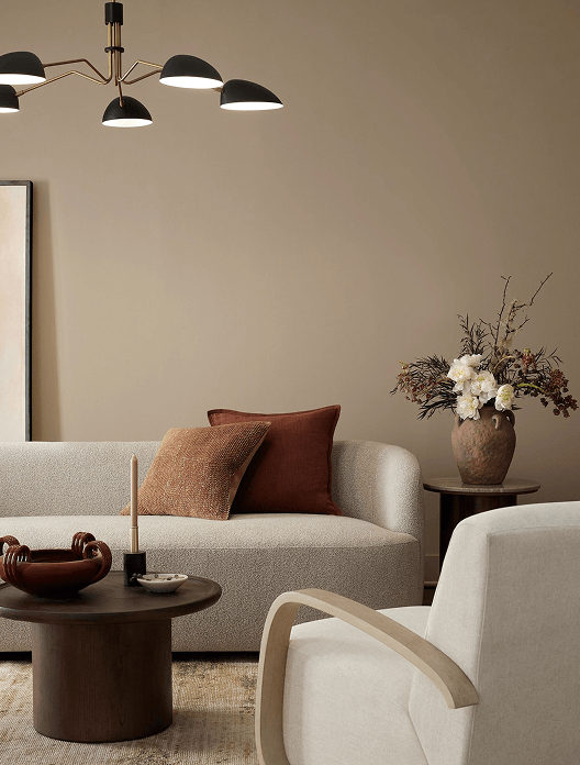
Image courtesy of Sherwin-Williams. Sanderling SW 7513, November 2026 Color of the Month.
Why Sanderling Works So Well
Neutral doesn't have to mean plain. In fact, some of the most beautiful interiors are built around subtle layers of neutral color.
Sanderling strikes an appealing balance between beige and taupe. Its warmth can help a room feel comfortable and welcoming, while its understated character keeps the overall look polished and current.
I can see this color working especially well in:
Living rooms: A welcoming backdrop that pairs beautifully with cream upholstery, natural wood, and soft textiles.
Bedrooms: A calming, understated color that creates a restful atmosphere.
Home offices and libraries: A little warmth and depth without overwhelming the space.
Open-concept areas: A versatile neutral that can help different rooms feel connected.
How I'd Style This Color
One of my favorite things about a good neutral is how easily it works with other colors and materials.
With Sanderling, I'd lean into natural textures and a relaxed, layered palette:
Cream and ivory: For softness and a light, airy feel.
Natural wood: To bring out the warmth in the paint.
Soft greens: For a subtle connection to nature.
Warm metals: Brass or aged bronze can add a refined finishing touch.
Textured fabrics: Linen, woven materials, and cozy throws help keep the space from feeling flat.
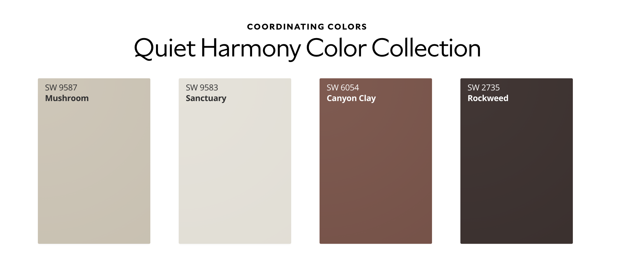
Sherwin-Williams also highlights coordinating colors in its Quiet Harmony collection, including Mushroom SW 9587, Sanctuary SW 9583, Canyon Clay SW 6054, and Rockweed SW 2735. These offer some interesting directions if you'd like to build a more layered palette.
A Little Staging Perspective: Why the Right Neutral Matters When Selling
As a staging consultant, I look at paint color a little differently. It's not just about choosing something beautiful. It's about understanding how a color will work with the home, the lighting, the existing finishes, and ultimately, how buyers will experience the space.
When preparing a home for sale, the goal is to create a cohesive, welcoming environment that allows buyers to imagine themselves living there.
A thoughtfully chosen neutral can help:
Create a more consistent look from room to room.
Make spaces feel brighter and more connected.
Complement a wider range of furniture and decor.
Give a home a fresh, well-maintained appearance.
Help buyers focus on the home's features rather than distracting color choices.
That doesn't mean every home should be painted the same shade of beige! The best color choice depends on the home's natural light, flooring, cabinetry, existing finishes, and overall style.
Sometimes a simple paint refresh is all a room needs. Other times, the existing color is already doing its job beautifully.
Before You Pick Up a Paintbrush...
One important reminder: paint colors can look surprisingly different from one room to another. Natural light, artificial lighting, flooring, and nearby furnishings all influence how a color appears.
Before committing to an entire room, I always recommend getting a sample and testing it on your own walls. Look at it in the morning, afternoon, and evening before making your final decision.
You can explore Sanderling, view its coordinating colors, and order a sample directly from Sherwin-Williams.
Explore Sanderling SW 7513 at Sherwin-Williams
Thinking About Preparing Your Home for Sale?
The right paint color is just one piece of the puzzle. From furniture placement and styling to paint recommendations and practical home improvements, thoughtful preparation can make a meaningful difference in how your home is presented to buyers.
At Mynor & Associates, our complimentary staging consultation with Ina helps listing clients identify the updates that make the most sense for their home, selling goals, and budget.
Because sometimes the best transformation doesn't require a complete makeover. It starts with knowing what to change, what to keep, and where to focus your attention.
Thinking about selling? We'd love to help you prepare your home for its next chapter.